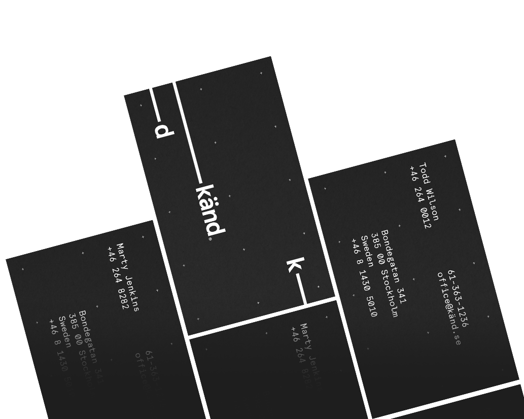
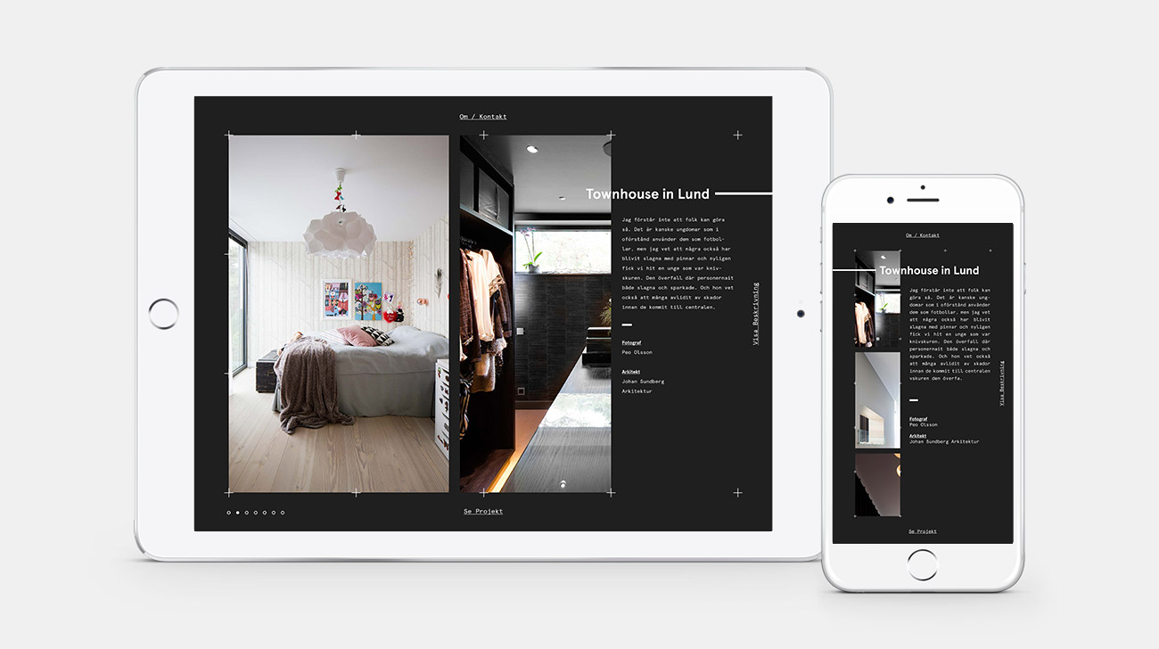
KÄND ARCHITECTS

Känd Architect studio, already having the foundation for a great identity for which to build upon, I created a refined solution both in the office and online.Creating a succinct brand identity that properly reflected their simple yet elegant approach to architecture.


Main-Image

I wanted to breathe new life into their existing brand. I was sensitive to the nature of their business: their brand needed to be present yet functional when using and viewing their stationary, but somewhat under-stated when viewing their work, allowing the subtle nuances of their design come through loud and clear. By creating a future-proof, utilitarian, malleable grid system, in which to place blocks of copy and their new logotype, I was able to allow for a consistent motif that is easily adapted to any piece of collateral.

In-part, the identity gives a subtle nod to the functional nature in which architecture is often synonymous with: A simplified grid system motif, black and white colour palette, neo-grotesque typefaces used for headings, coupled with a monospaced typeface used for body copy and details. I carried the brand hierarchy through to their website only presenting it only when being introduced and allowing their work to take center-stage when viewing their projects. Creating an annual visual diary for känd was an idea I had to allow a bit more freedom of artistic expression to accompany stunning images of their designs. This editorial-esque publication would be sent to budding clients.

The Problem & My Solution

The problem wasn’t so much a problem as it was an opportunity, Känd already had the foundation for a solid identity, it just needed a bit more development. Playing off of the form vs function nature of känd’s line of work, I was able to create a flexible brand that was present in form when needed, but could also stand as a functional accent to their work when required.